Sunday, 28 March 2010
Scooter for Pirates group (exhaust)
Just got the Scooter model from JB and I 've started to get some shaders for it. This scooter is suppose to be 'Pimped out'so I'm looking at fitting it with some stainless stell or chrome exhaust. I found this pre made shader which looks good in the picture above but when I render it, it looks dull.
I decided to go with my own custom shader and textures which give a better result.
Creating the metalic shader with Blinn
Created metal texture in photoshop
Too bright, so I darkend the texture
Better
Wednesday, 24 March 2010
Almost there
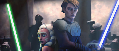
Trying to stay true to JB's vision I've gone back to the Clone Wars images to try and find more things to emulate. I notice that the environments in Clone Wars are colour orientated. By this I mean the background colours seem to dictate the mood and feel of whats going on in the shot. We could use this technique In Dummy as we need all the tools we can use to convey the emotions out the characters. We could probably tweak the colours of the scenes in After Effects. The Environments are also less cluttered and are very simple to the one that we have at the moment. I don't want the Environment to distract from the attention from the 2 characters.
What I'll be doing next
1. JB mentioned that he wanted the Dummy poster on the wall so I need to get that file off him. I'll try and find a Matrix poster as JB is into that Sci-Fi stuff (Rolls Eyes)
2. Texture the keyboard
3. Texture the Bin
This week to get the main area textured where the main shots and action are going to be.
Ah yes one small problem that I saw....... The Chair!
Yes This Chair has 56,408 F@(King polys. There had better be low poly version of this.
Rant over. Feel Better now.
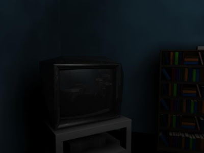
TV Texture
The textures for the TV are also painted so that it goes with the rest of the textures.
In Photoshop:
I created Cloud Effects>Noise>Gausian Blur>Colourize> Levels
For the Glass I used my custom glass shader and played around with the reflectivity and also darkened it.
The lights are Gay in this scene and are pissing me off a little.
Book Case Done
This Render looks as dark as hell but these are the lights that were in the scene (-_-)
Anyway the book case is done along with the books. JB wants to put titles on the spines of each book. This is no problem but will be time consuming as there are ALOT of books. I'm not sure whether the books are in the main shot either so it may not be worth it. Also if we add Focus Blur in our shots, I don't think it would be worth going through the hassle putting titles each book. I maybe wrong though.
Drawing Table
I don't really like the colours for this. I tried looking on the internet for a drawing table that was similar but all I could find were these:
I decided to go with browns and a wooden style drawing table so that it would complement the pine wood table but I'm having second thoughts about that. I'll get back to this another time but I'm going to try and get the book textures out the way.
Texture Update
I have been painting the textures for the books, wallpaper, and and folder cases. I feel that it is starting to look more like the clone Wars style especially with the books. I turned the reflection up on the grey cabinet to emulate a steel cabinet. I will be adding normal maps and Bumps to help stop the textures from looking flat.
Potts and Table
Star Wars "Clone Wars" Style Textures
I've taken a look at the Computer game version to see how they have recreated the Clones Wars look. My first impression is that the colours are vibrant and bold. This gives the Clone Wars a cartoony feel to it. The textures still contain a bit of detail in them. The colours in this shot a complementary to each other. The Blues and purples from the characters complement the night sky setting in the background.
The look as if they have been painted so I'll have to look at some photoshop tutorials on painting textures. I think that Lighting is going to play a big part in getting the textures to lok similar to the ones in Clone Wars.
Dummy Enviroment
This is the Dummy environment 2 weeks ago. Speaking with JB, he firstl;y wanted the environment to look photo-realistic but then changed his mind. Instead he wants the texture for this environment to be similar to Clone Wars. I've nether seen Clone Wars before and I was nether a Star Wars fan either, so I decided to look at the texture style more closely.
Wednesday, 10 March 2010
Subscribe to:
Posts (Atom)